Calgo is a Web-based software for Contact Centers, which is suitable for customer acquisition and customer service work, and also enables the management of incoming and outgoing calls for large customer services or even very small businesses. For 10 years, Calgo has been continuously adding new functions to keep up with new and new customer needs. The idea of the redesign was formulated in the head of the management as a response to the development of competitors and the increasing use of Support, the latter of which stemmed from unfavorable navigation. The software is now one of my favorite contact center solutions in Hungary with lots of new solutions.
The software
The software serves the performance of Call Center tasks (making outgoing calls when the Call Center initiates calls to customers) and customer service tasks (receiving incoming calls). In the software, you can create campaigns, edit call scenarios (scripts), load a phone number database, and the software manages customer campaigns, projects, phone numbers, initiates calls, records conversations in the form of voice recordings, and includes the statistical data and content of phone conversations, tabular in form.
I worked on the Calgo software interface for 2 years until the beginning of 2018, since then the work continued and the software also got a new name: Comnica.
My tasks
As a UX/UI designer, my task is the user-friendly redesign and visual update of the software's admin interface.
Field research
Conducting an interview
Competitor analyses
Persona creation
User Journey Map
Making and testing prototypes
Wireframes
UI design
Creating a Pixel Perfect design
UI handover to the development team
Development of Design System
Research and Problem definition
Mapping business needs and goals
Support is overloaded with customer calls due to navigation difficulties.
Over the years, many functions have been incorporated into the software to satisfy the customer’s needs, which, however, broke the uniform navigation of the software.
Emergence of new user needs.
Development of competitors, appearance of new ones.
Outdated design.
Back-end constraints.
Based on the interviews with the company's managers, the above problems emerged. In order to get to know the user side, I first organized additional interviews with members of Calgo Support, then at the contact centers that use Calgo, where I also conducted field research.
Field research
During the interviews, I also observed the users doing their work in their own environment in order to better understand their daily tasks and difficulties. I documented the visits with photos.

It was a big challenge for me to create a user-friendly interface for workers in a profession unknown to me. The field research helped me a lot to gain insight and understand the daily work of the CC (Contact Center) employees.
Call Center with 40 people
Interviews
In order to map out the problems formulated by the management in more detail, I conducted additional interviews with the members of Calgo Support, who meet first-hand the daily difficulties of the users. I collected them and ranked them according to frequency. Thus, I was able to pay more attention to the more problematic parts during the Interviews.

When selecting the interviewees, an important aspect was that the size of the companies and the diversity of the tasks were representative.

I also had the pleasure of interviewing users who knew and used the software of competitors in addition to Calgo. This also helped in competitor analysis.
Competitor analysis
In addition to the interviews, the other important basic research was the competitor analysis. In which I assessed the 2 most significant domestic competitors and some foreigners in order to examine the possibilities and prospects for development.

I summarized the strengths and weaknesses of the competitors in order to see which functions are inevitable to develop in order to stay in the competition and to assess what Calgo can be better at and what is worth emphasizing.
Person zones
Creating the Person Zones helped to summarize and concentrate the results of the research. The created perzones are work-focused, as the software is used during work. In addition to motivations and frustrations, I thought it important to indicate the tools that users use in addition to Calgo to remind them of their work processes outside of the software and to show their competences.

I used the perzone during the entire development process.
The user's main challenges and most important goals
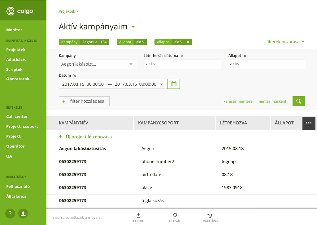
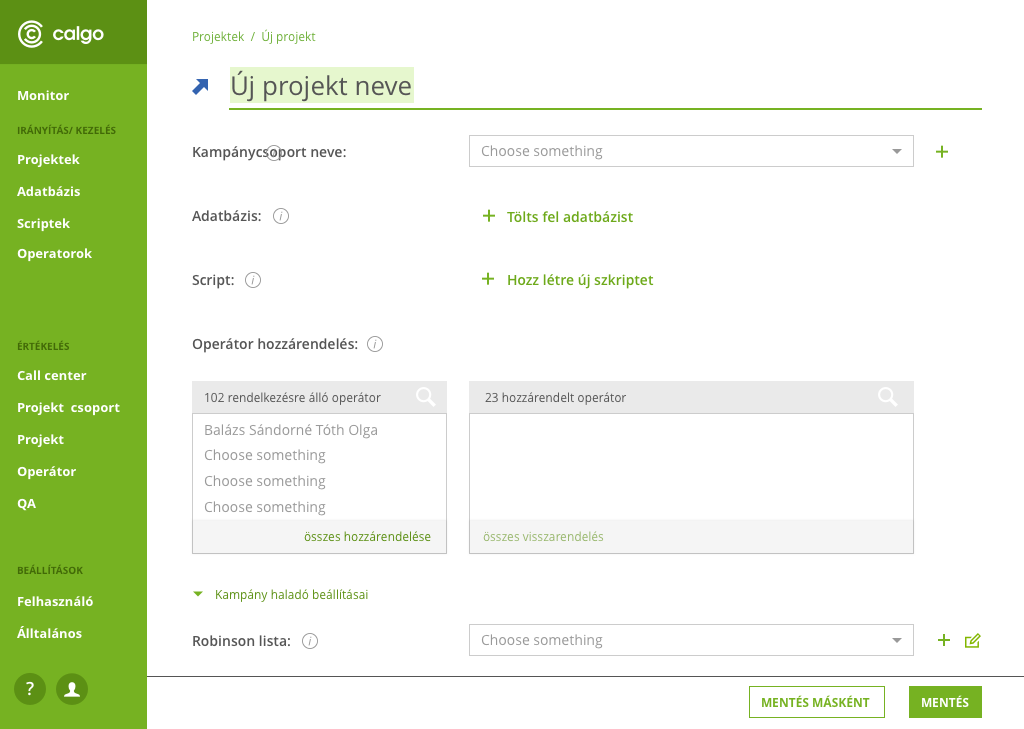
Starting a campaign could only be set up and edited on several different pages, it is difficult to get back to the starting point with a lot of navigation.
solution: Development of a unified campaign launch interface
unified navigation
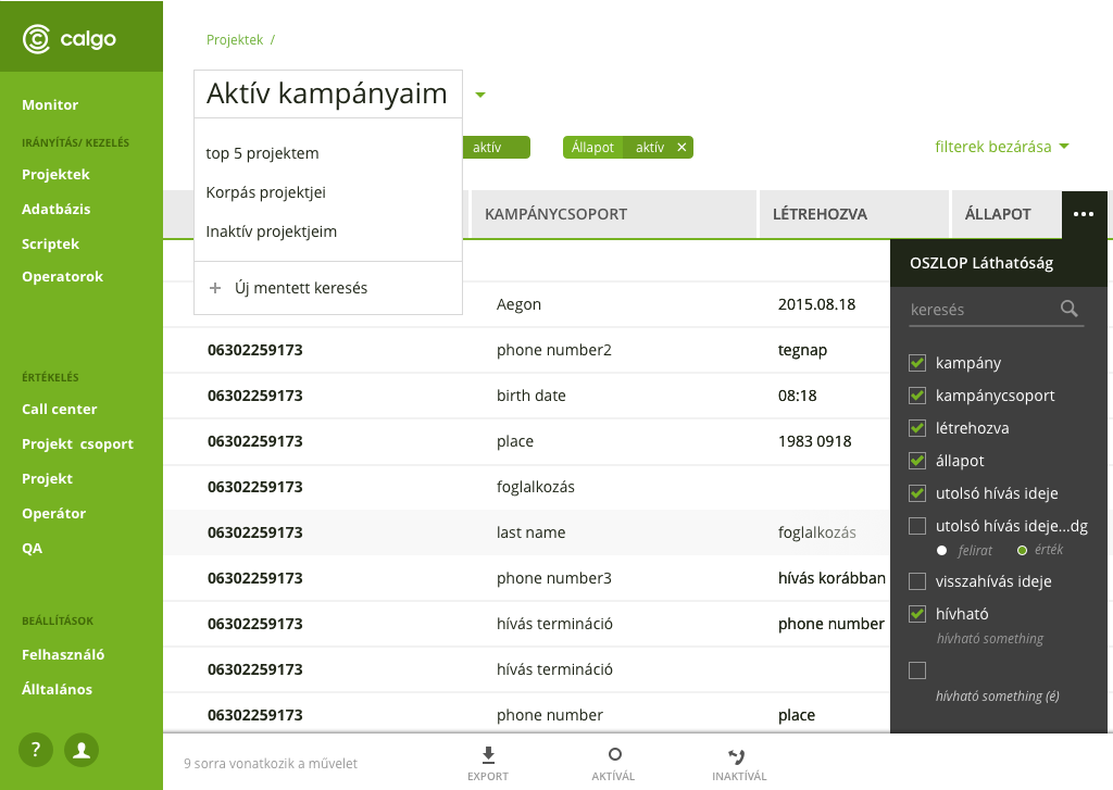
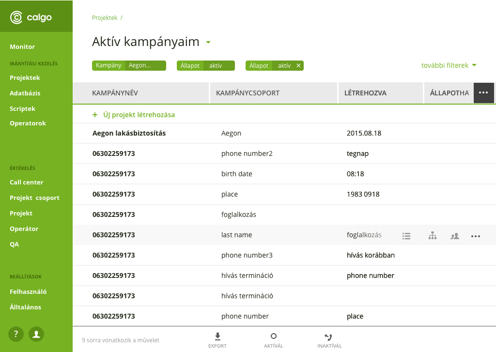
Huge, difficult to interpret and manage data lists. An important task for preparing daily reports and statistics.
solution: Development of detailed filtering options
exporting them
Time-consuming operations that can be done individually
solution: the introduction of group operations
Designing solutions
Lo-fi Prototypes
After clarifying the problems, I made paper-based low-fidelity prototypes to quickly outline the solutions, they helped me present and test the ideas.

In many cases, one page/view has quite a lot of functions/interactions, which made the pages too crowded. I looked for solutions and best practices for these.
Best practices
One of my main and most reliable sources was Material Design and Google products. I could best solve the complexity of the software's date picker using the example of Airbnb.

For navigation, I researched foreign call centers, e.g. Talk desk

I also looked for examples of the following solutions:

-in place interaction
-in place editing
-button bar
-bulk operation
-notification

During the best practice research, I took into account the solutions that best fit the tasks of my own users.
Wireframes
To work out the details, I started making high fidelity wireframes. In these, I planned every little detail so that every detail would be in place and there would be a solution for every use-case.

The attached image shows the complexity of the date picker.
Visual design
UI Design
As soon as I validated the detailed wireframes with the users and the back-end team, the visualization was developed. I chose a simple and fresh style, since users use the interface all day long to work and perform complex tasks. Transparency is therefore important to them.
Tools
I made the UI designs in Sketch.
The prototypes came to life in Invison.
Documentation was done in Jira and Confluenc.
I gave the designs to the frontend developers in Zeplin.